Radiant Sunset: Clashing Color with Summer Bracelet Design
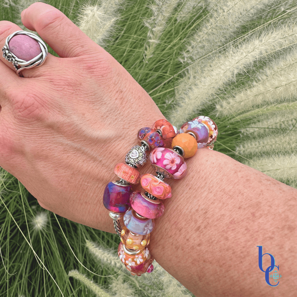
July has arrived with a fierce, searing heat that practically shimmers off the pavement. It is far from tropical here, but the intensity of the midsummer sun demands an equally intense response. Rather than retreating into muted tones, it is time to electrify the wrist in this summer bracelet design.
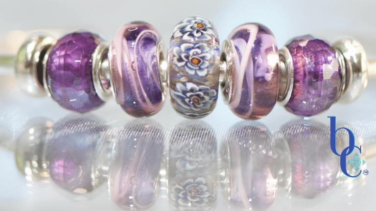
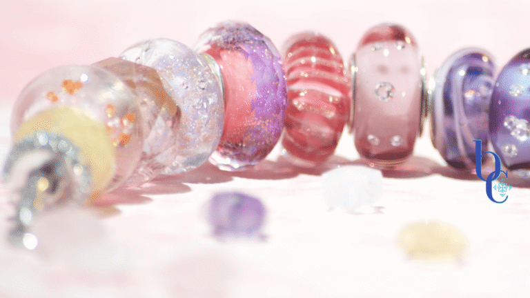
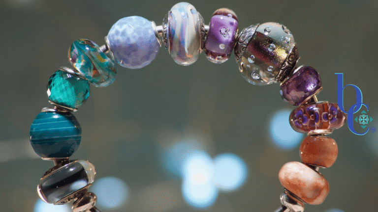
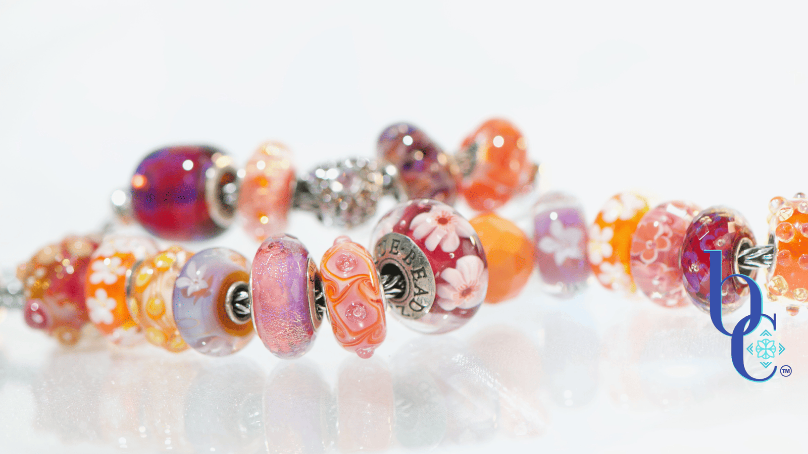
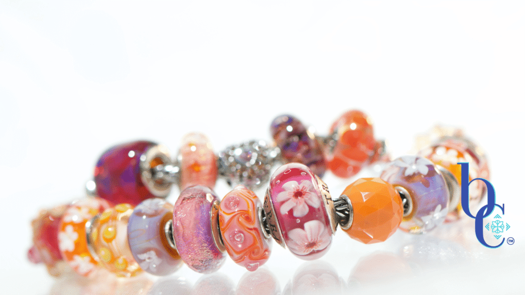
This bright curation is a deliberate, unapologetic clash: bright tangerine, hot magenta, and deep, saturated violet. It is an “Anti-Beige” manifesto wrapped in sterling silver and artisan glass—a tactile celebration of the season that refuses to blend in.
The Art Director’s Perspective: Polarizing Pigments
Orange is a gorgeously bold, entirely polarizing color. In design, it demands attention and refuses to be ignored. The secret to styling such a demanding hue without overwhelming the eye lies in the anchoring elements. By threading in heavily textured silver blooms and glass beads that feature a soft, watercolor blend of orange and pink, the jarring edge of the bright orange is beautifully reined in.
As you start pulling pieces for a high-contrast palette, you might be surprised by your own inventory, I know I was. The vibrant orange draws out the tiniest, almost hidden flecks of tangerine and peach suspended deep within purple and pink glass blends. The visual glow of these clashing colors sitting side-by-side creates a kinetic energy that neutral palettes simply cannot replicate.
The Educator’s Note: The Slow Art of Curation
There is a distinct, heavy clink that comes from a fully finished, densely packed silver and glass bracelet—a rhythmic sound that tells a story of time. Collections of this magnitude are curated over years, not minutes. They are heavily influenced by the distinct light and architecture of your travels, the artists you discover, and the evolving shifts in your own aesthetic.
When a design like this catches the eye on social media, the immediate reflex for many is to ask for a quick fix: “Where can I buy this exact set?” In a world accustomed to fast-fashion giants like Temu or Shein, the concept of slow curation can feel foreign. But you cannot replicate the smooth, cold touch of bespoke artisan glass or the intricate depth of hand-poured silver overnight.
Skip the FOMO. Give yourself the peace of mind to let your collection evolve. Add a bead or two at a time, watching how the textures and tones interact. It is a beautiful puzzle that you are solving at your own pace.
The Photographer’s Insight: Capturing the Glow
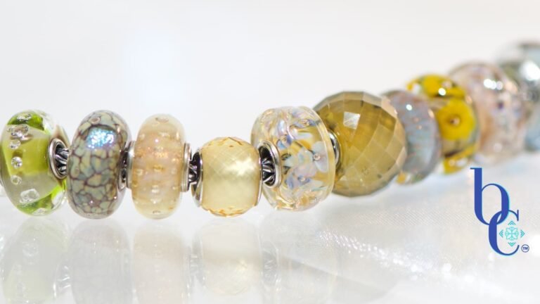
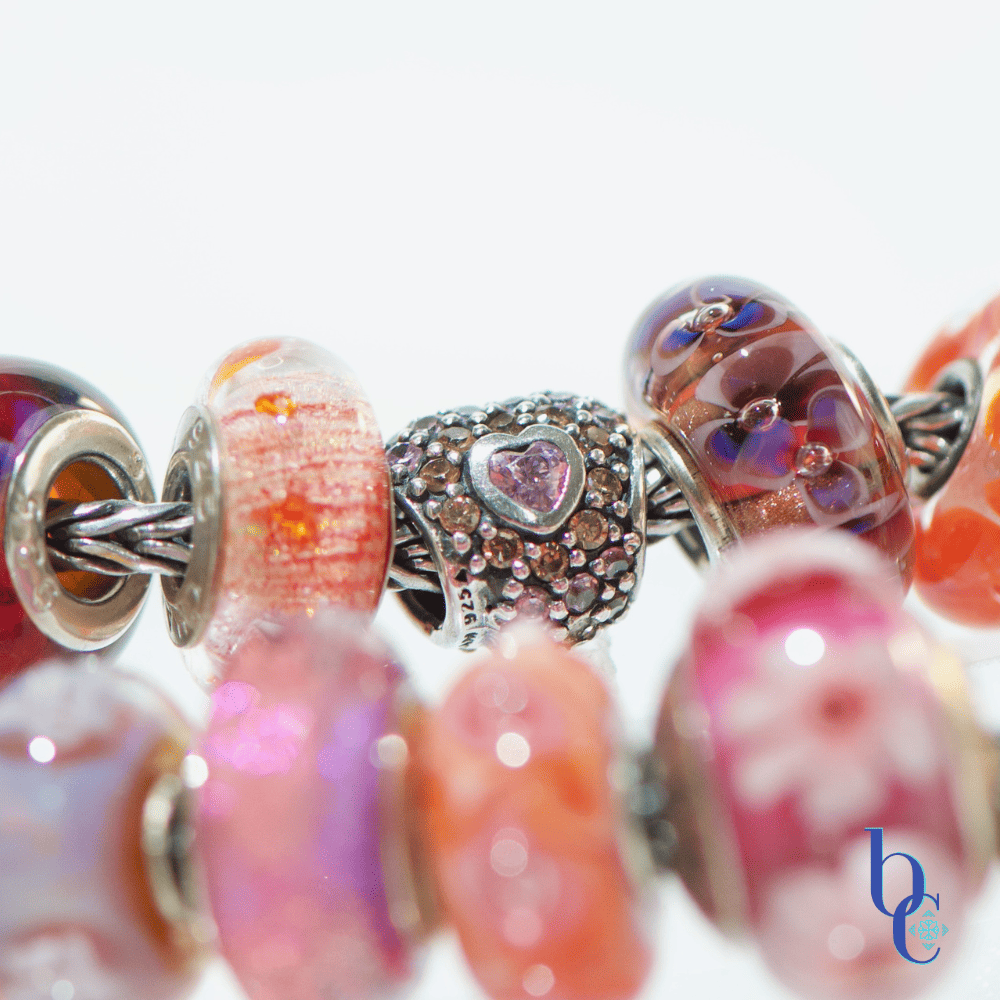
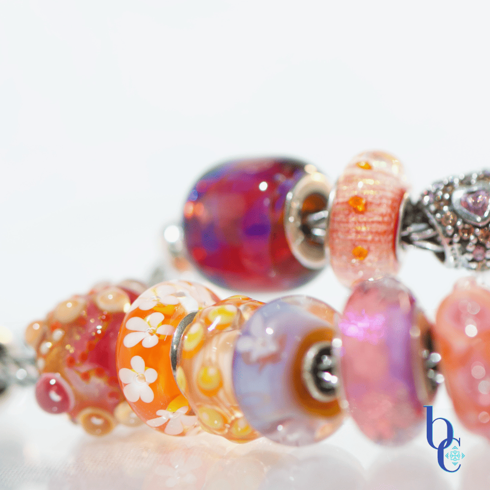
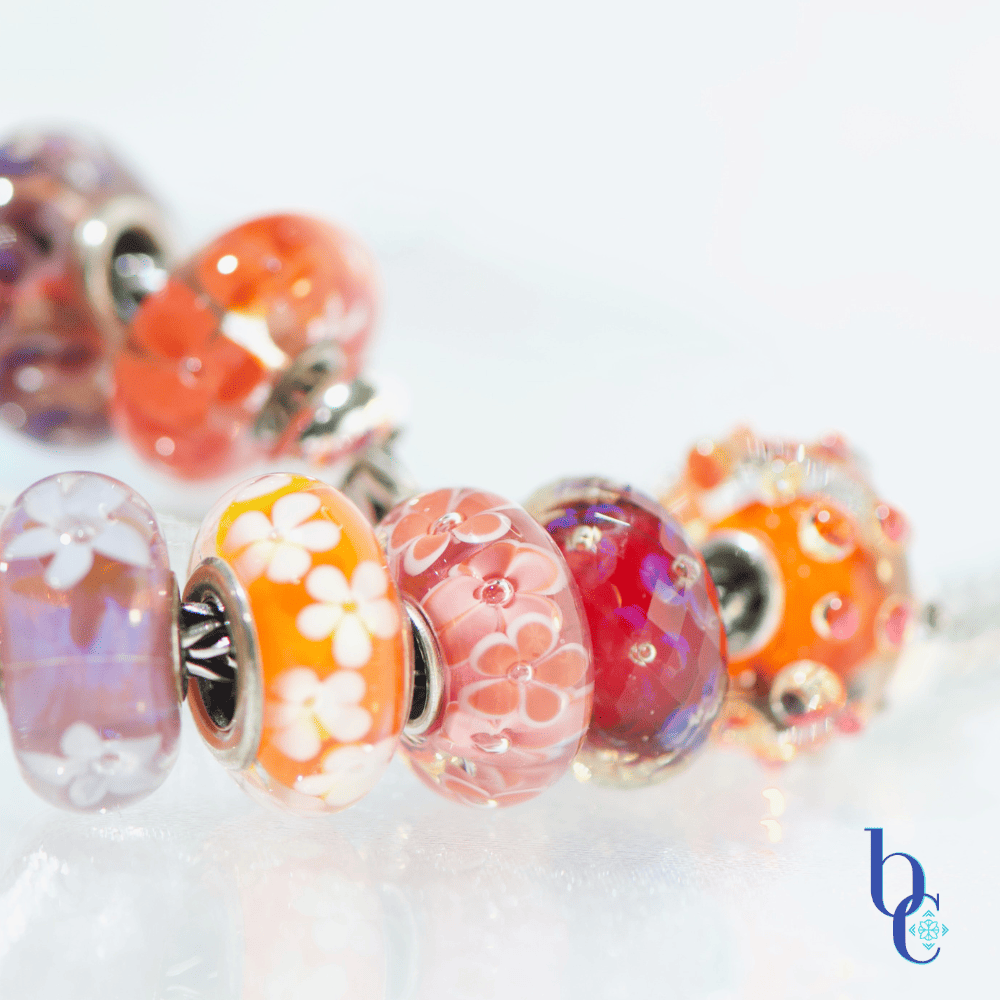
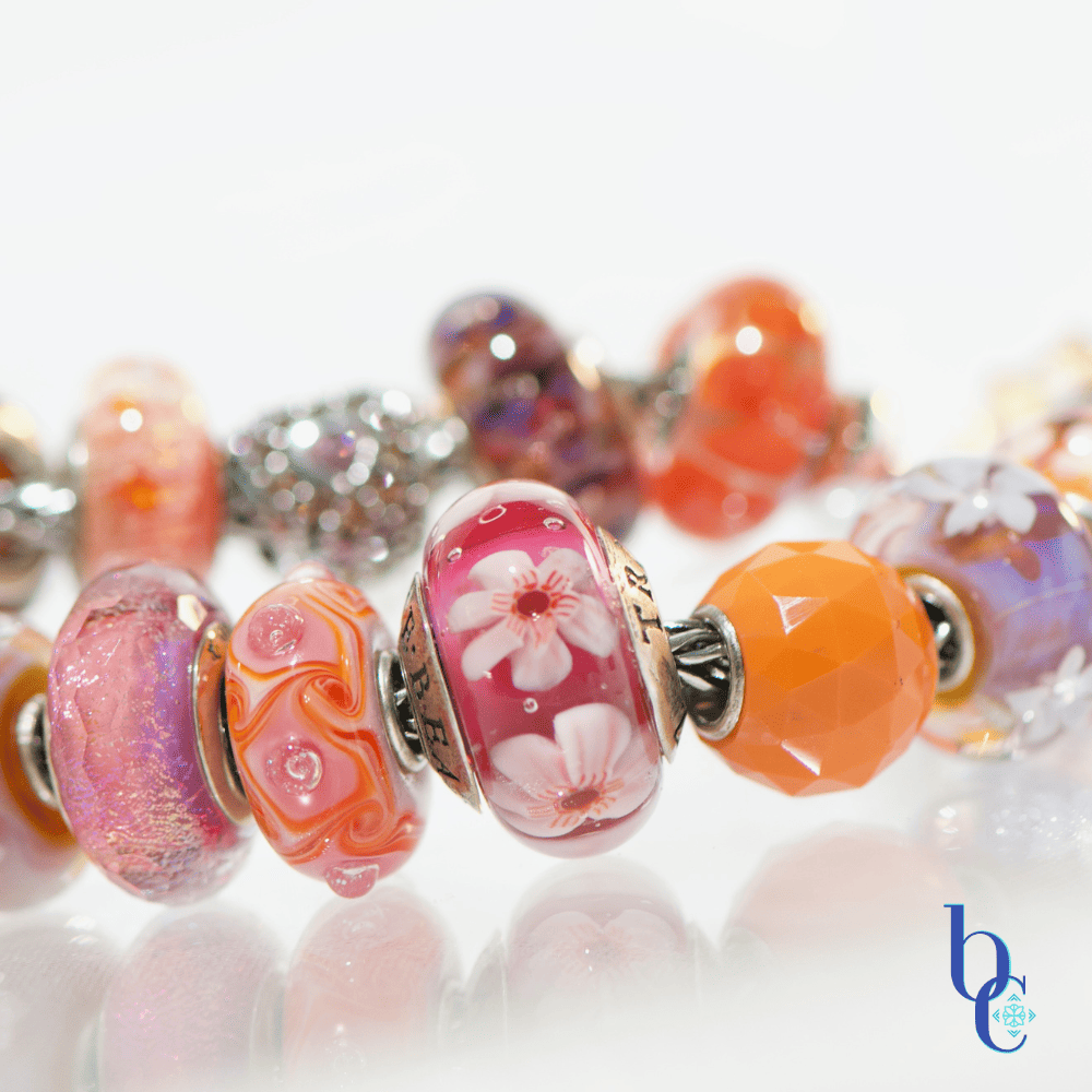
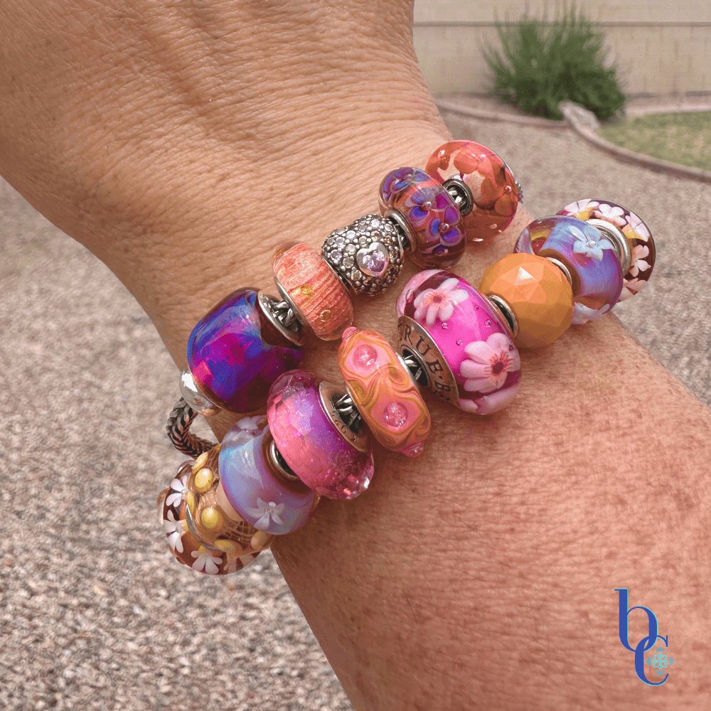
To properly capture the saturated depths of these hot pinks and purples, the visual strategy requires a dual approach. Indoor studio shots, isolated against non-competing plexi risers or an underlit base, allow the macro lens to expose the intricate details and internal glitter of the glass.
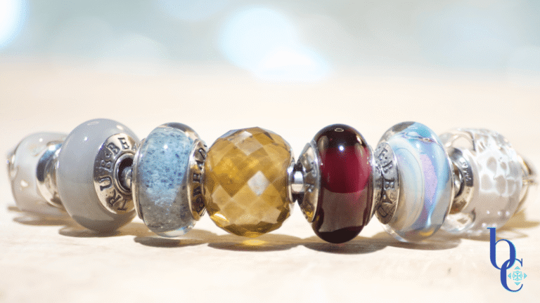
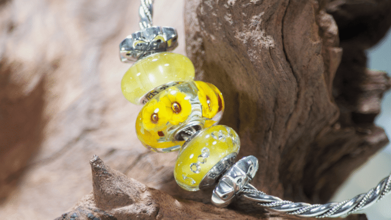
However, glass comes alive under the open sky. Stepping outside to capture the natural outdoor glow allows the sunlight to refract through the beads, showcasing the true, vibrant intensity of the “Radiant Sunset” palette. Since I didn’t want to decide which looked best with the beautiful colors, I added them both!
The CharmStack© Visualizer Diagram
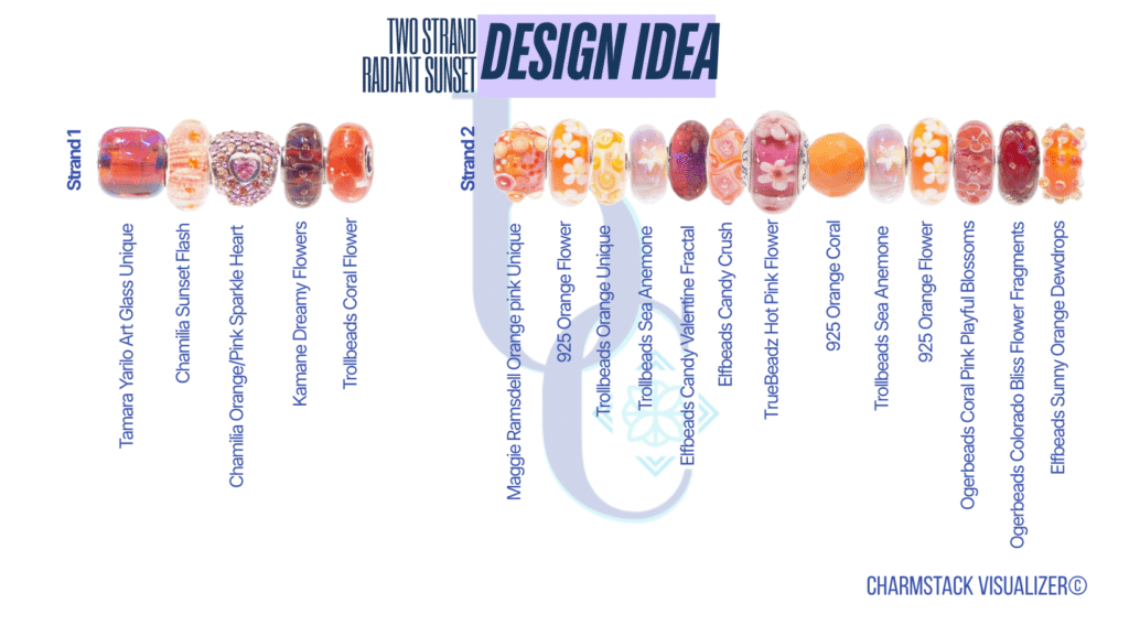
The Radiant Sunset Curation
A high-contrast visualizer for your summer stack
- The Anchor Point: Deep, saturated amethyst or violet artisan glass to ground the palette.
- The Flash: Opaque, bright tangerine glass (look for pieces with suspended glitter or foil for added texture).
- The Bridge: Blended or watercolor beads featuring both hot pink and subtle orange to seamlessly connect the clashing tones.
- The Texture: Highly detailed, oxidized sterling silver floral charms (hibiscus, lotus, or abstract botanical shapes).