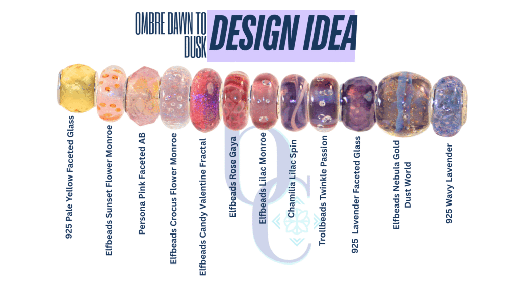
Color Themes: Ombre or Block?
When you start designing a charm bracelet, the first question is usually structural: “Do I group my colors in blocks? Or do I fade them?”
Block vs. Ombre: The Standard Approach
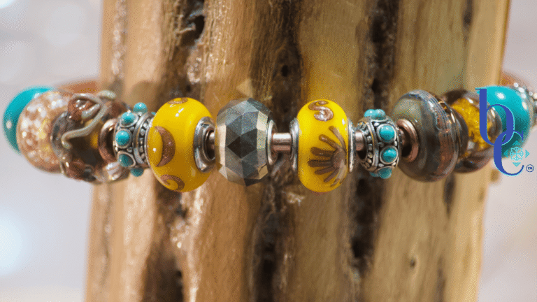
- Color Blocking: Grouping three blue beads, then three green beads. It’s graphic, bold, and safe.
- Monochromatic: Using fifty shades of a single color. It’s elegant, but can lack depth.
- The Ombre Fade: A gradual transition from light to dark. This is the classic “waterfall” effect.
The Anti-Beige Angle: Ombre Your Mood, Not Just Your Beads For this design, I wanted to challenge the standard definition of “ombre.” I didn’t just want to fade from pink to purple. I wanted to capture the light of a single day.
As a photographer with over 40 years of experience chasing the “golden hour,” my eye is trained to notice how light changes temperature from dawn to dusk. The morning isn’t just “pink”—it’s a cool, misty rose. Noon isn’t just “blue”—it’s a hard, bright azure. And twilight isn’t just “purple”—it’s a deep, velvety indigo that feels heavy.
The “Dawn to Dusk” Progression I ignored the rules of symmetry. I ignored matching sets. Instead, I let the light guide the bead selection:
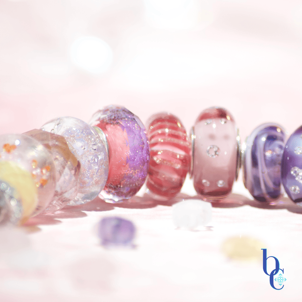
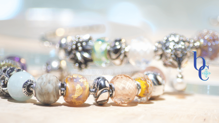
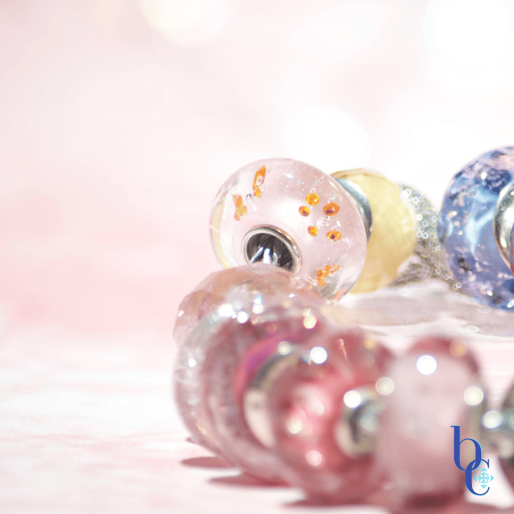
- Dawn (The Awakening): Soft, translucent pinks and milky whites (Rose Quartz and Moonstone vibes) to represent that first, quiet light.
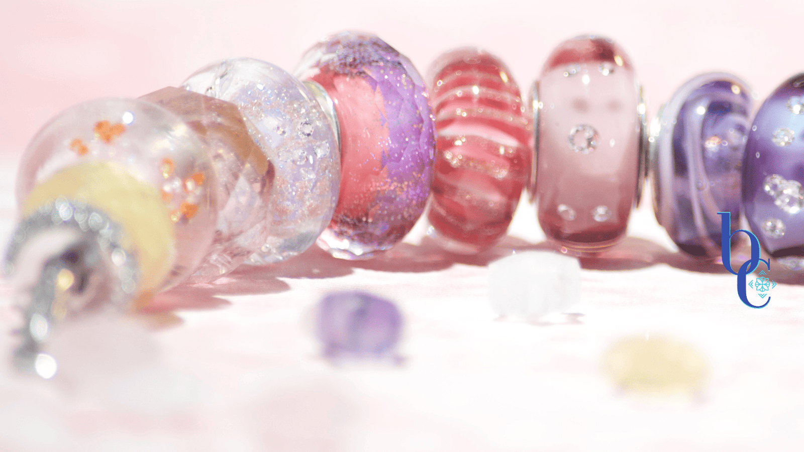
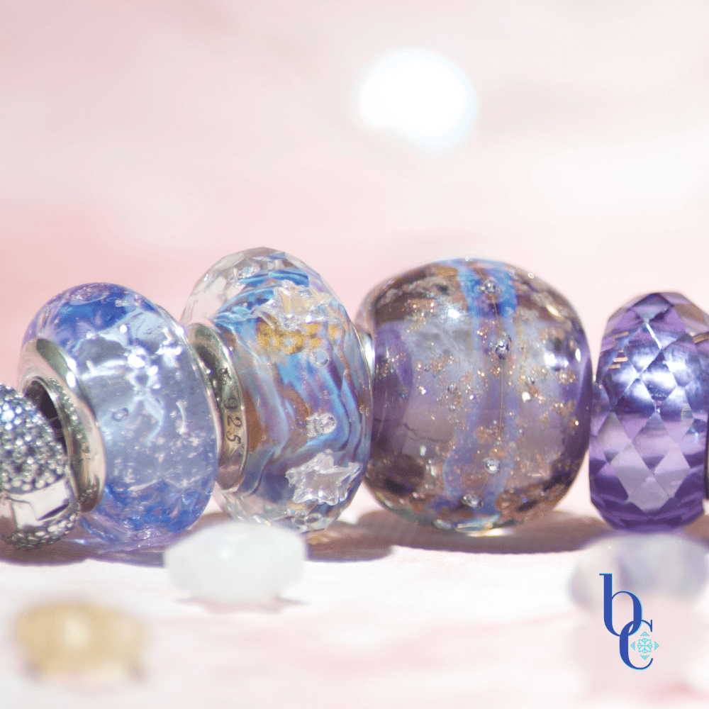
- Zenith (The Energy): Bright, clear blues and crisp cyans to capture the high sun.
- Golden Hour (The Warmth): Ambers and warm honeys (Citrine) for that fleeting moment before sunset.
- Twilight (The Rest): Deep purples, fluorite greens, and heavy blues as the world goes to sleep.
The result is a bracelet that doesn’t just look pretty; it grounds me. One glance at my wrist, and I travel through the entire day. It’s a reminder that time is passing, but in a beautiful, rhythmic way.
Your Guide to Changing Light into Beads
The Photographer’s Light Palette
Translating the Sun into Beads
Pro Tip: Don’t worry about symmetry—let the light dictate the flow!
When You’re Ready to Break Out of the Box
When you are ready to expand your collection beyond the big-box commercial brands, exploring the textures and art glass of indie darlings like Elfbeads and TrueBeadz opens up a whole new world of design possibilities. (This was my secret sauce for this ombre design!)
The Ombre Dawn to Dusk Charmstack Visualizer© Diagram