Beyond Beige: Mastering the Palette Curation of ‘Abyss & Amethyst’ ; A Glam Coastal Colorway Design
The world of color is vast, beautiful, and often overwhelming, but true creativity isn’t found in the infinite—it’s discovered in limitation. A curated color palette isn’t a rulebook; it’s a structural keystone that empowers us to build meaningful narratives through hue and texture. ‘Abyss & Amethyst’ is my response to this creative challenge: taking a specific, hex-coded colorway from Sarah Renae Clark’s Color Cubes and translating it, bead by precious bead, into a sophisticated piece of Glam Coastal Colorway wearable art.
Method: The ‘High-Focus’ Curation of a Pre-Formed Colorway
This design was a purposeful exercise in High-Focus visual editing. It’s an approach built upon defining a system—a palette—and creating a precise curation of materials that satisfies every sensory constraint within that system. We aren’t just wearing an off-the-rack arrangement; we are curating an authentic, custom experience built entirely upon the specific vibrational frequencies of the sea and the shifting sand. Here is the sensory blueprint for ‘Abyss & Amethyst.’
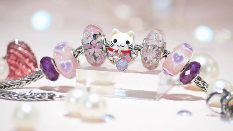
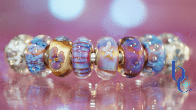
Visual Narrative: The Sea Spray and the Treasure
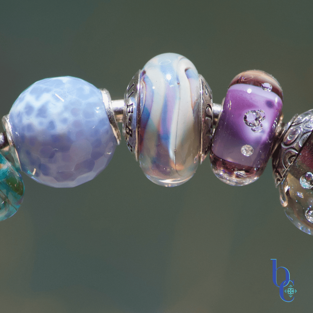
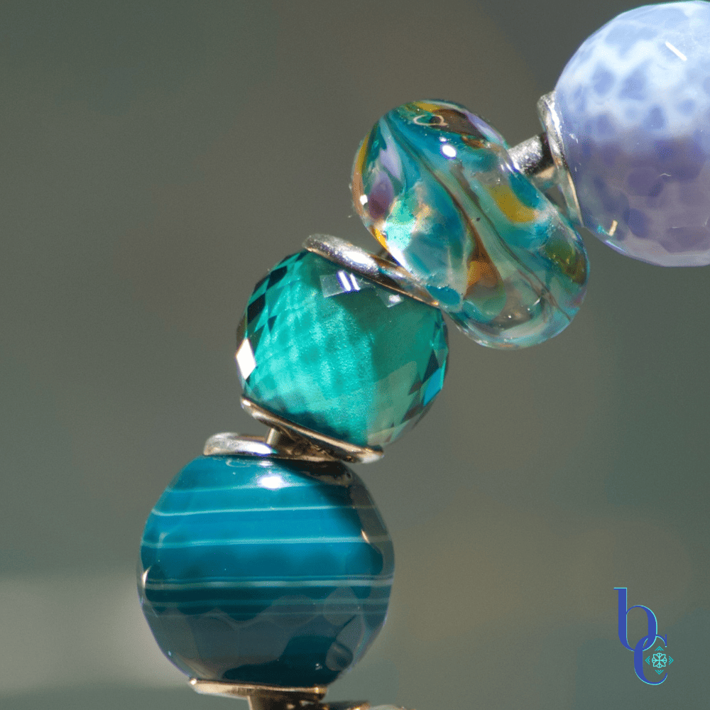
The visual story begins and ends with the palette. The Sarah Renae Clark Color Cube #699 provided the exact coordinates, forcing a decision on every saturation difference and texture blend. While initial coastal thoughts might drift to kitschy charms, my Art Director POV insisted on an Anti-Beige stand: ditching the sea turtles and mermaids in favor of a pure, unadulterated glass edit.
Instead of literal symbols, we found the coastal narrative in raw materials:
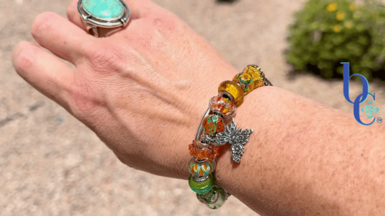
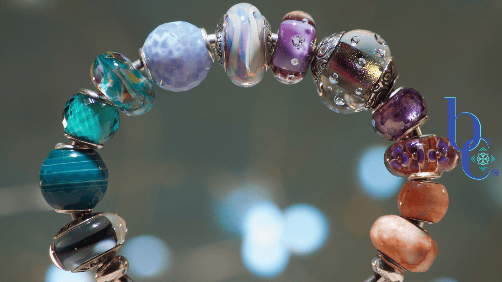
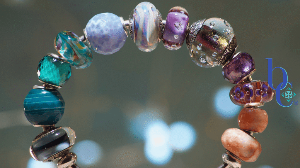
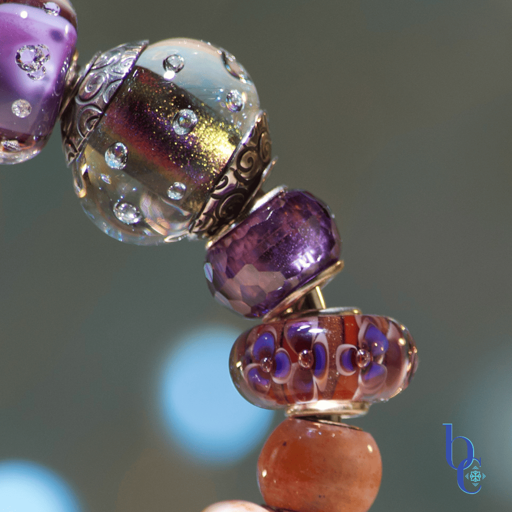
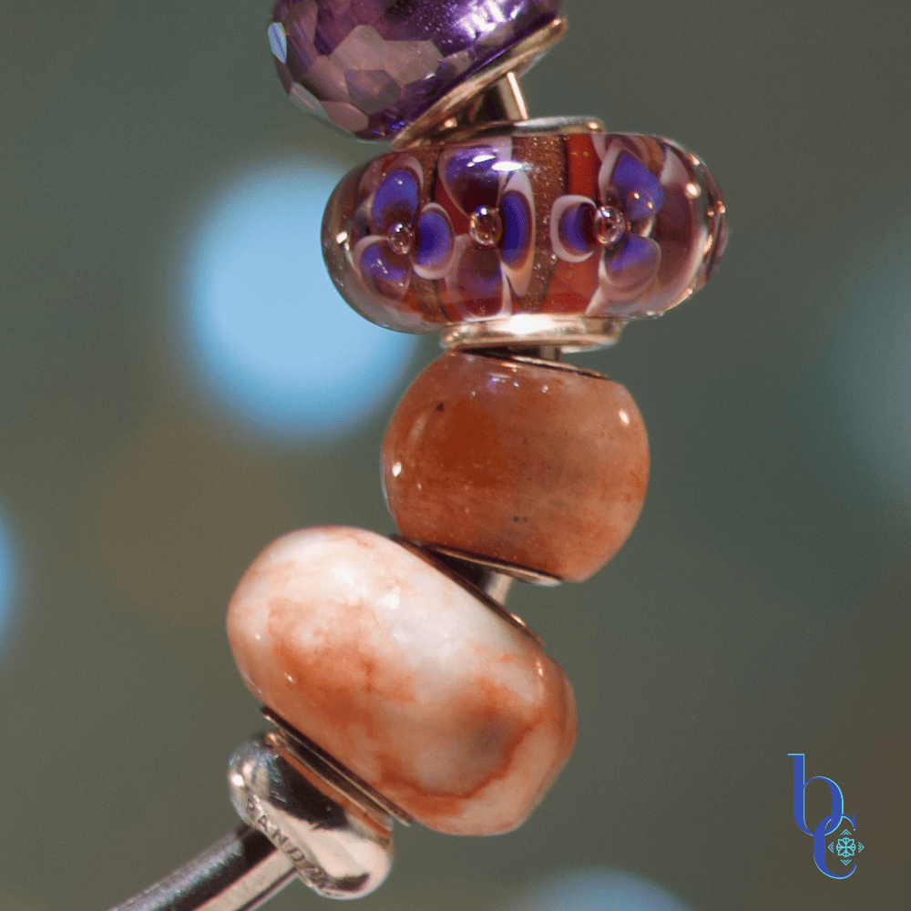
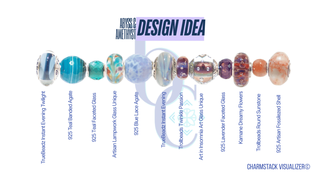
- The lovely rhythm of aquas and teals coordinates beautifully with the unexpected, deep purples and high-polish orange of the Kamane ‘Dreamy Flowers’ glass.
- We colorblocked these components on a sleek, solid cuff bangle, designed precisely to maintain the stack’s integrity. Unlike chain carriers that shift and twist, a cuff bangle never obscures your view. All you see is the bespoke, harmonic flow of color, from deep turquoise to shimmering sunset.
Auditory Resonance: The ‘Resonant Clink’
There is a satisfying weight and sound to this curation. A chain bracelet provides a light, multi-toned tinkle, but a packed, solid copper or silver cuff has a resonant, single clink and a definitive, heavy stack. The stones—faceted or smooth—create a physical, tactile response. They don’t just sit there; they vibrate, creating bold frequencies that ground and energize. This is the difference between an accessory and a powerful, personal artifact.
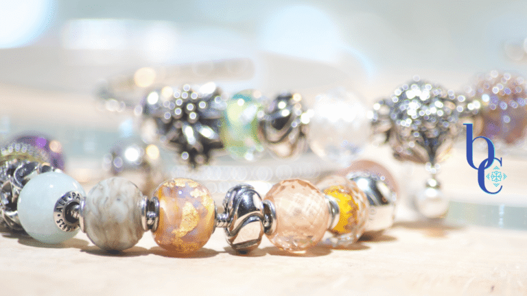
Tactile Curation: The Coastal Ecosystem in Bloom
The Photographer’s and Educator’s POV here is that asymmetrical design creates interest, but curation creates harmony. Every bead provides a standalone focal point. We curated the tactile journey by combining the smooth, luminous shimmer of the dichroic and artisan lampwork glass with the raw, natural sparkle and the deep chatoyancy of sunstone. Adding these natural elements, whether they are polished smooth or faceted, creates a powerful feeling of the entire coastal ecosystem—from sea spray to shimmering sand—right on your wrist.
The Inspirational Palette
Curated Inspiration
Abyss & Amethyst Palette
© Bijoux Chat | Custom Color Edit
The Charmstack Visualizer
“If I could be anywhere on Earth, I’d be in the Mediterranean. Every bit of that location inspires me!” – Bijoux Chat
Inspiration Credit: The color palette utilized in this design methodology was sourced from the Sarah Renae Clark Color Cubes (Cube #699). Bijoux Chat is an independent editorial blog and is not currently sponsored by Sarah Renae Clark.