Beyond the Bead: Mastering the Art of Big Silver Focals
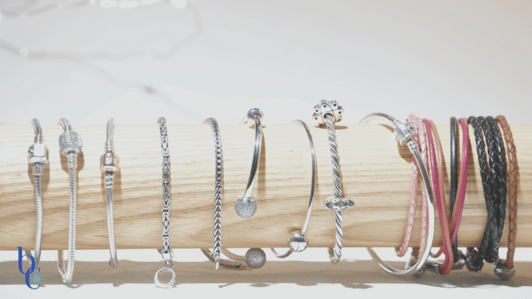
There is a distinct sensory satisfaction to substantial silver. It’s the cool, solid weight against your wrist when you first put it on; the deep, resonant clink it makes compared to the higher-pitched tinkle of smaller glass beads.
In the “Anti-Beige” world of Bijoux Chat, we believe jewelry shouldn’t just sit politely in a straight line. Sometimes, a design needs a disruptor.
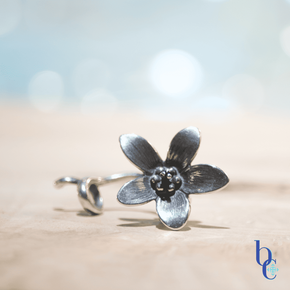
For this project, we are stepping away from traditional symmetrical bead-stringing and embracing the unruly beauty of Big Silver Elements. We’re using pieces that refuse to obediently follow a curve—like the trailing stem of the Trollbeads Anemone pendant—to create a bracelet that feels less like an accessory and more like a bespoke treasure.
Here is how we anchor, balance, and embrace the asymmetry of statement silver.
The Anchor: Embracing Visual Weight
When you introduce a large silver element, you aren’t just adding another bead; you are adding gravity.
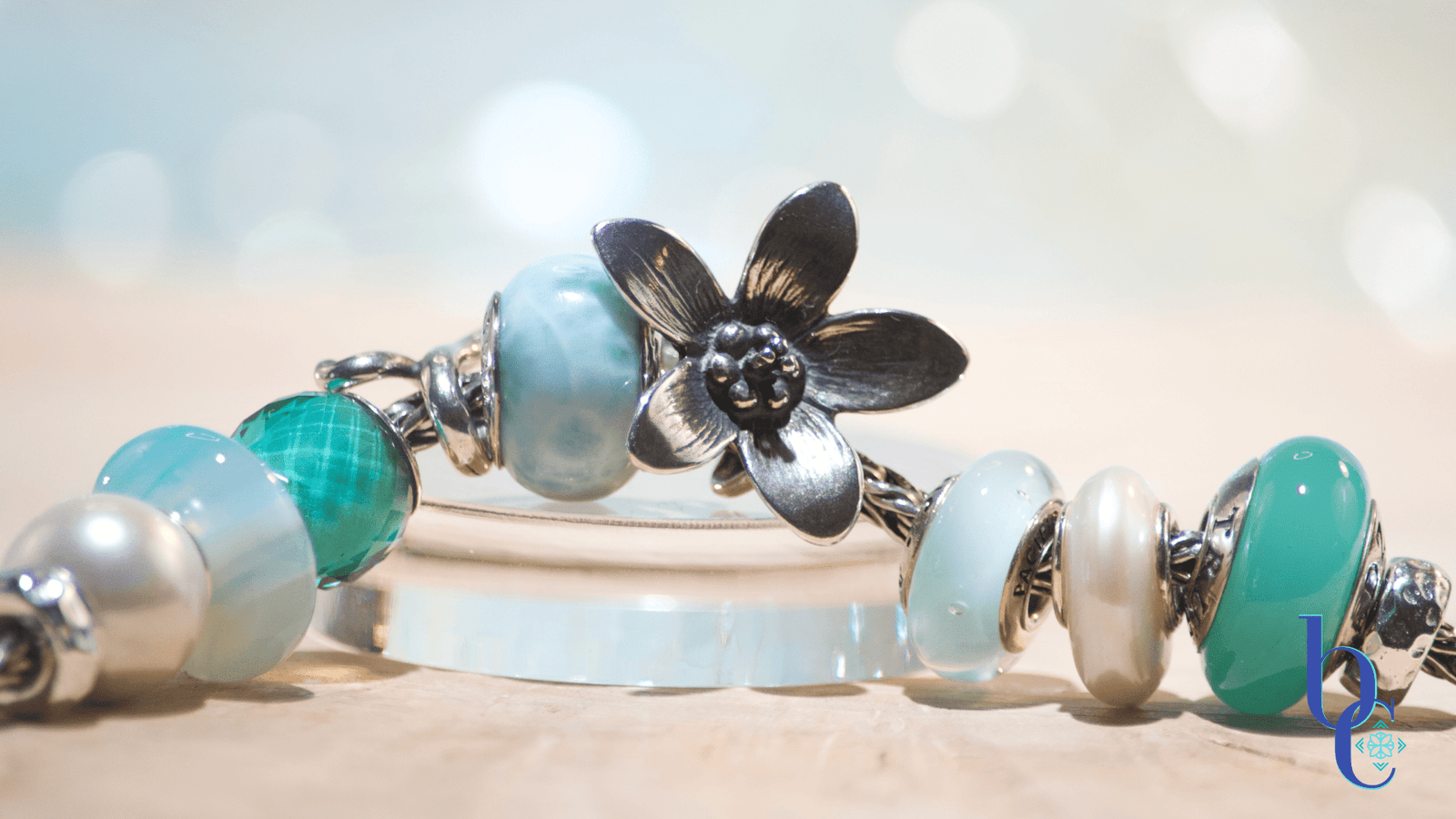
From an Art Director’s perspective, a piece like this silver flower changes the entire architecture of the bracelet. It dictates the flow. Because of its size and its trailing stem, it has a definitive “top” and “bottom,” which challenges the traditional, rolling nature of a charm bracelet.
You have to let the big piece lead. It is the soloist; everything else is the choir.
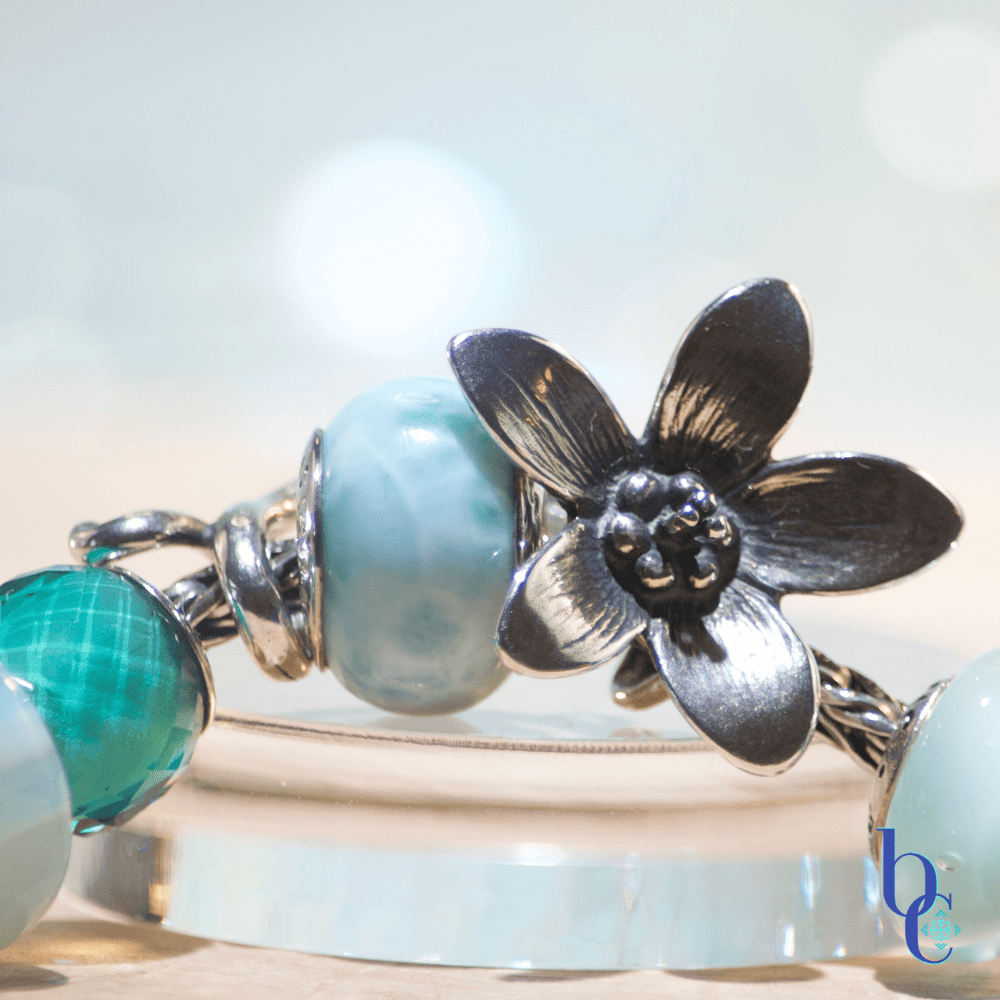
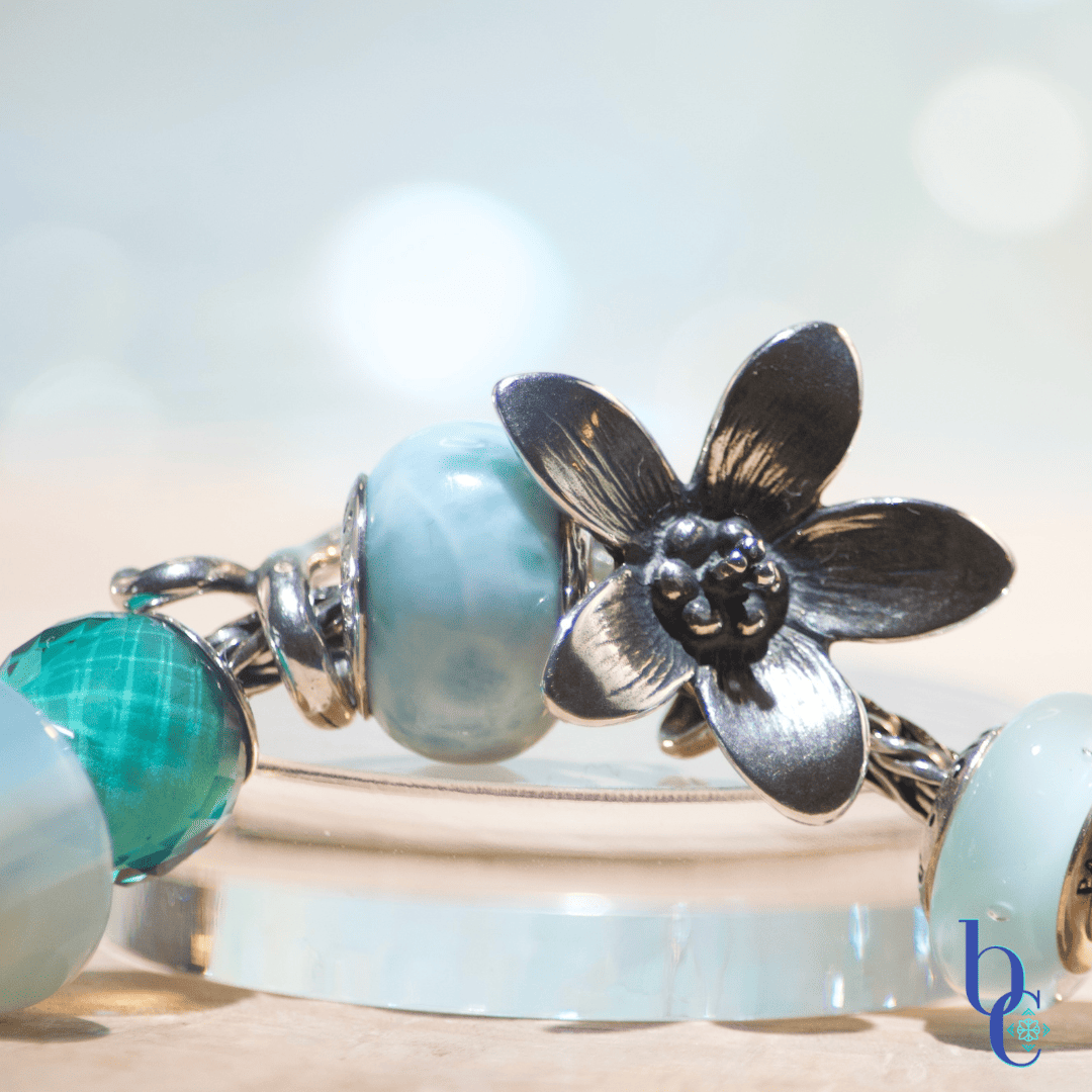
The Supporting Cast: Finding Balance
The mistake many make with big focals is trying to match their intensity right next door. If you crowd a large silver statement piece with other busy, dark, or heavy beads, the design becomes chaotic and heavy.
To let the silver sing, the supporting cast needed to be whisper-soft.
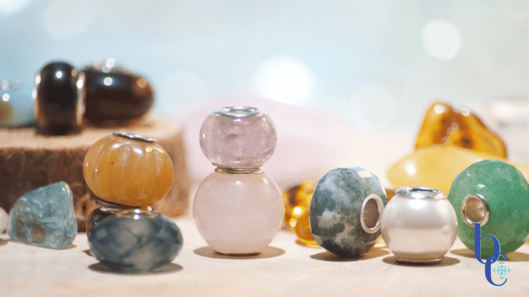
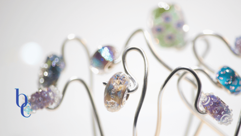
I chose a soothing palette to counter the industrial gleam of the metal: the mellow, moonlit shine of natural freshwater pearls combined with Murano glass in aqua, cream, and translucent blues. The subtle sparkle of blue topaz spacers adds lightness without competing for attention.
These lighter elements create necessary “breathing room,” allowing the eye to rest before returning to the main attraction.
The Visual Tactics: Rules of Engagement
When styling pieces that don’t play by the rules of symmetry, it helps to have a game plan. We broke down the methodology of this design into our latest “Anti-Beige” cheat sheet.
From placing the anchor first to leaning into the irregular curves, here are the rules of engagement for heavy metal styling:
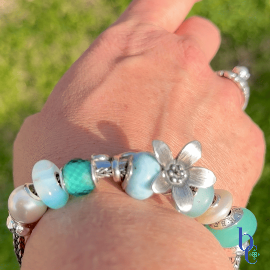
Going Big Silver In Real Life
The Recipe for Aqua & Silver
The “Aqua & Silver” Bespoke Recipe
Texture • Balance • Luminous Support
-
The Anchor (1x):
A large, asymmetrical silver statement piece (e.g., Trollbeads Anemone pendant or large flowerhug). -
The Luminaries (4-6x):
Natural freshwater pearls (creamy white, near-round or potato shape for organic feel). -
The Color Wash (4x):
Translucent Murano glass in aqua, light blue, or clear with white patterns. -
The Sparkle (4-6x):
Small silver spacers featuring subtle blue topaz or aqua Swarovski crystals.
The Aqua & Silver CharmStack Visualizer© Diagram

The Photographer’s View: High Contrast Drama
Finally, a note on capturing these pieces. A design with this much bright silver and lustrous pearl deserves drama.
If photographed on just a light background, silver can sometimes get lost. To truly accentuate the bright gleam of the metal and the blackened details that give the floral piece depth, I placed this design on a rough wooden surface. The simple backdrop adds light dimension, making the silver and the creamy pearls look glowing and ethereal.
Go bold with your next design. Find that one piece that is a little too big, a little too strangely shaped, and let it dictate a whole new kind of bracelet.
Here’s a Guide to Making Big Silver Work in Your Designs
Styling Big Silver: Rules of Engagement

01. The Anchor
Place it first.
It dictates the flow.
02. Breathing Room
Flank with lighter elements.
Don’t crowd the star.
03. Asymmetry
Let irregular shapes guide the curve.
Defy the line.
“Bold focal. Soft supporting cast. Bespoke result.”
— Bijoux Chat