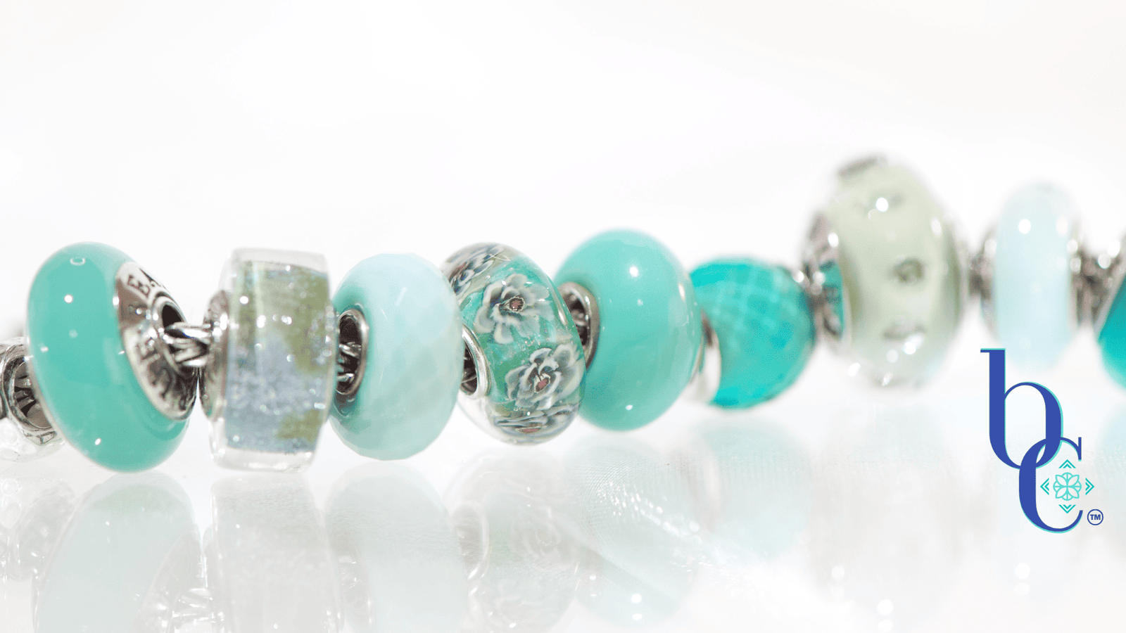
Cerulean Shift: An Icy Coastal Escape with Elfbeads Azure Styling
There is a distinct moment in the heart of summer when the desert heat becomes entirely too much, and the only remedy is a complete visual reset. Down in Dewpoint Studio, even though it is a little early, I was getting a jump on planning for fall. I had my colorblocking charts fully prepped for a transition into autumn—rich, saturated tones on my mind. Out of the blue, the universe (and Mila from Elfbeads) had a different, perfectly timed plan.
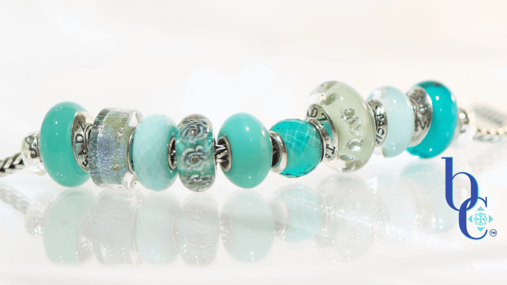
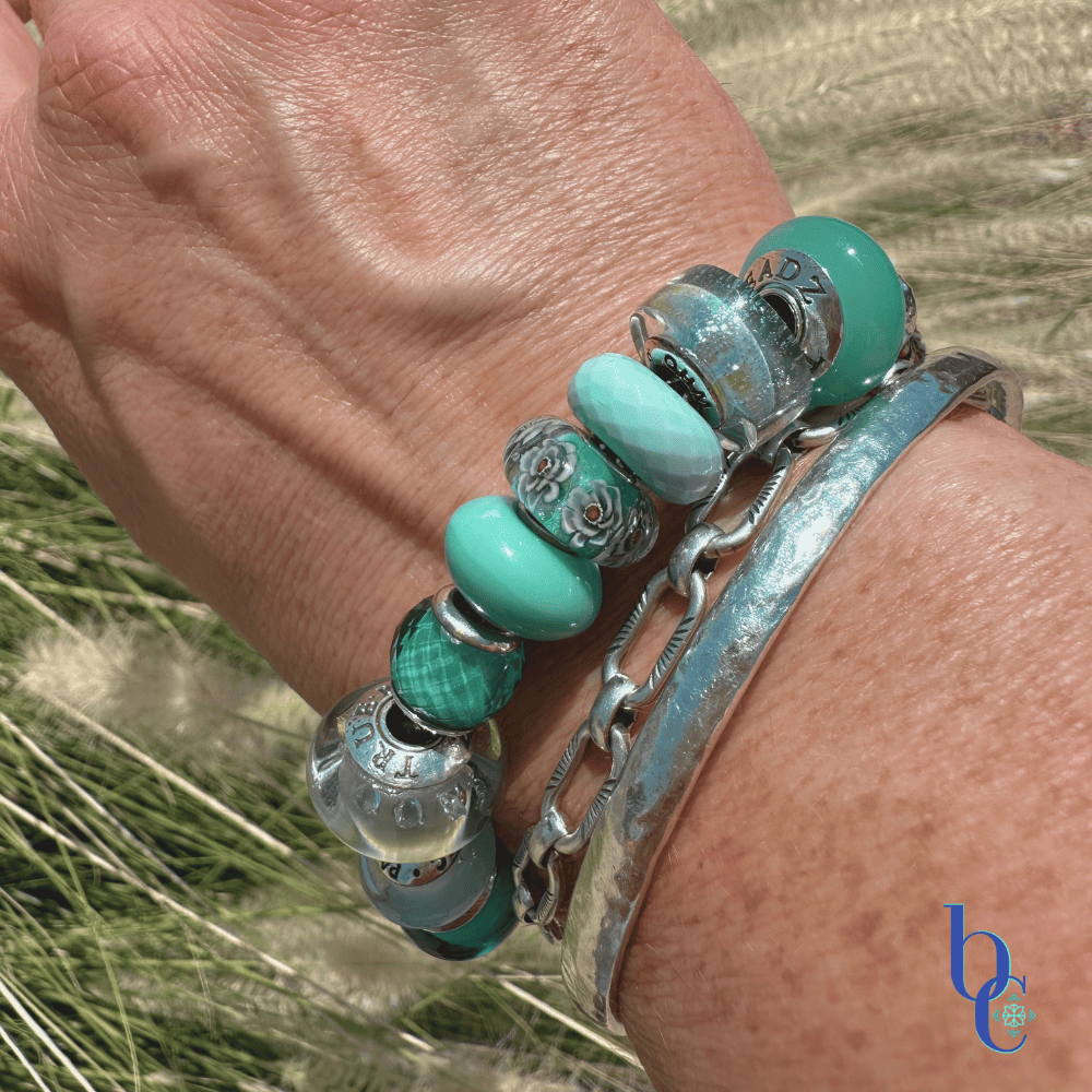
Tucked into my recent order as a surprise gift was this breathtaking Elfbeads Azure. The moment it slipped from the packaging, the entire mood of the studio shifted. This bead possesses an icy, refractive quality that instantly lowered the temperature in the room. Instead of the autumn glow I was craving, I was transported to the breezy, sunlit coastline of Nags Head—picture the stark white sands, the swaying beach grasses, and the brilliant, sparkling teal of the water catching the afternoon light. I knew I had had something special, and immediately set things up for a new design that would give the Elfbeads Azure styling a spotlight.
The Art Director’s Take
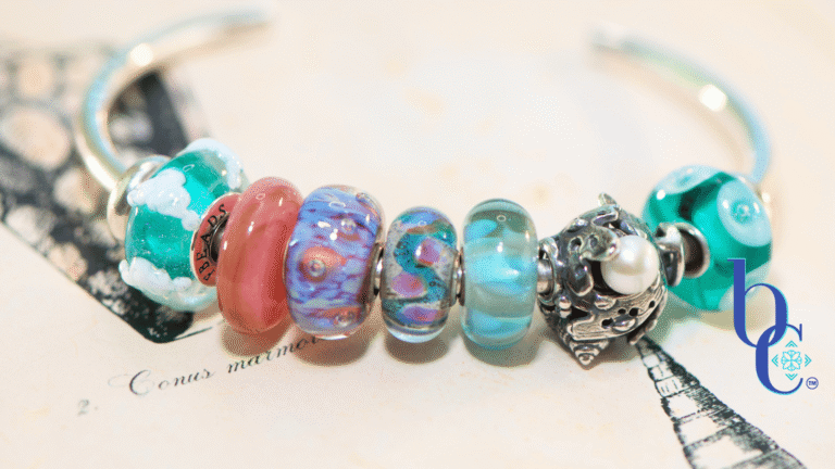
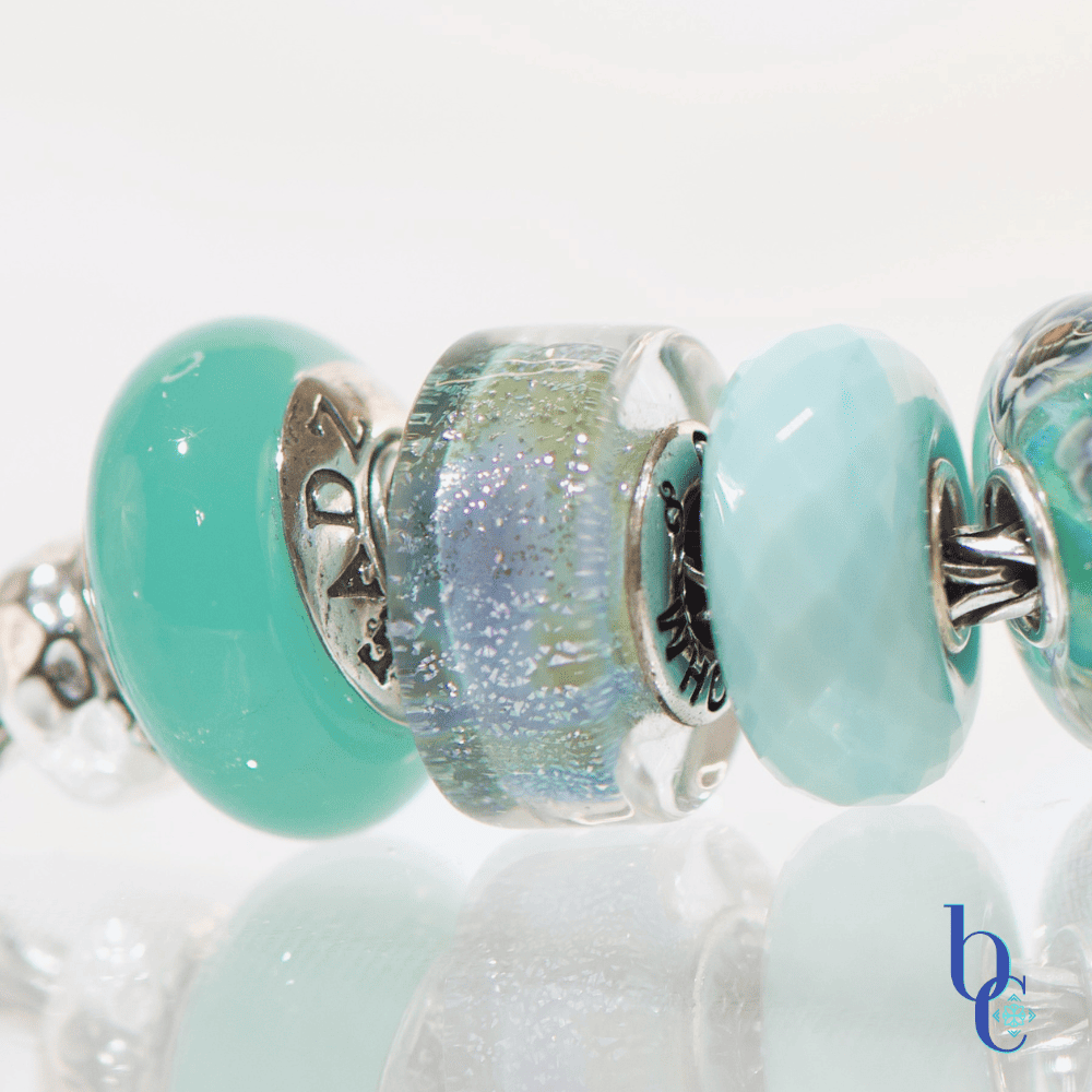
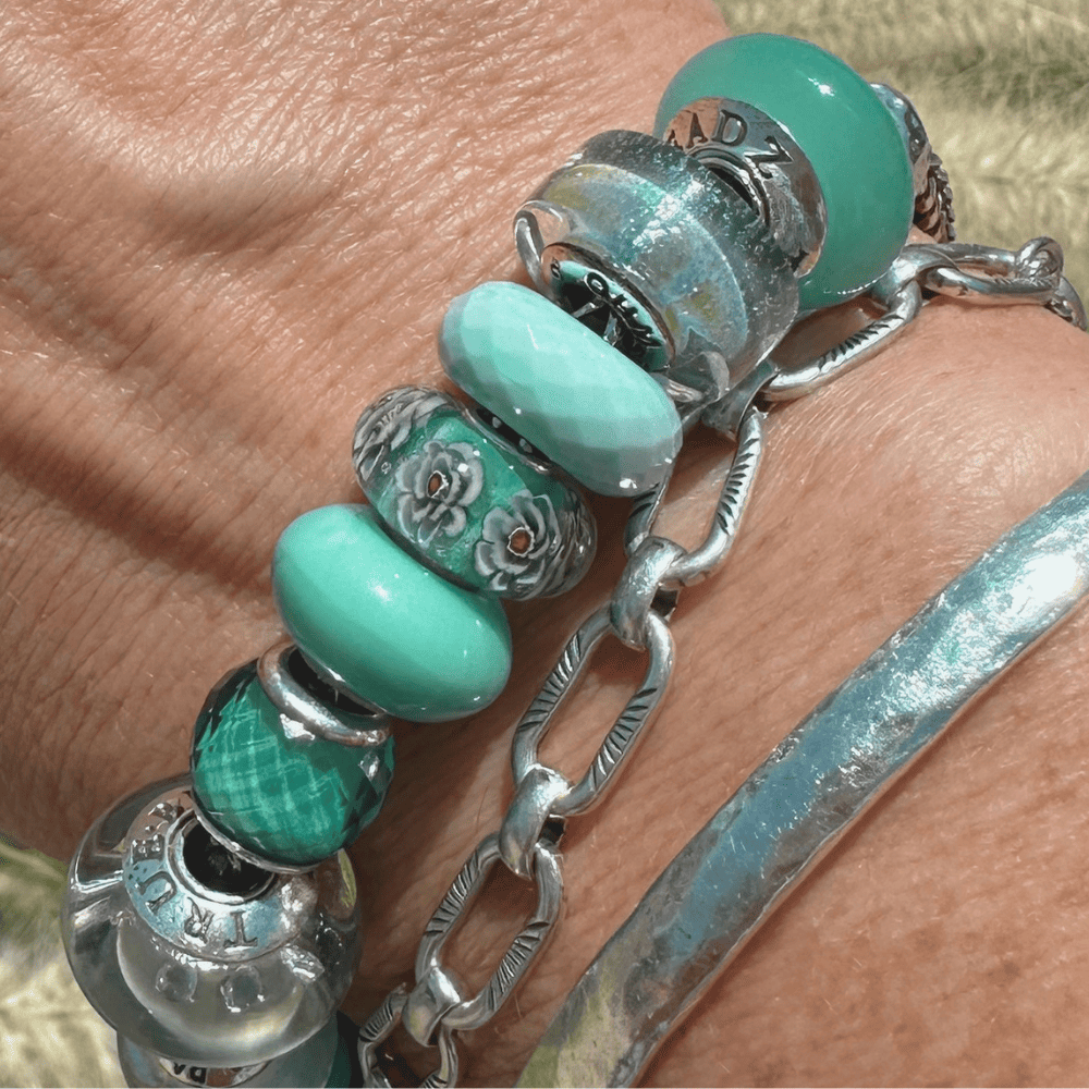
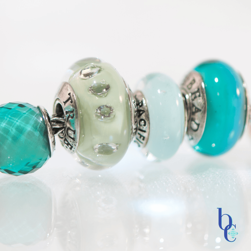
The “Cerulean Shift” design is a deliberate rejection of flat neutrals. It leans heavily into high-contrast saturation, pairing the deep, watery azure with pale sage and frosty mint tones. Tactilely, the stack is a dream. The smooth, domed surfaces of the sage glass play brilliantly against the sharp, faceted cuts of the teal spacers, creating a dynamic surface that begs to be touched. When rolled over the wrist, the crisp, heavy clink of the sterling silver cores striking the artisan glass provides that deeply satisfying auditory feedback every collector craves. It’s a wearable oasis, delivering just enough organic coastal sparkle to keep the styling exciting from every conceivable angle.
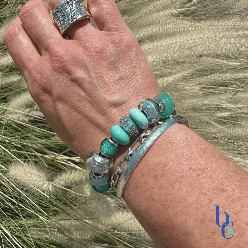
The Educator’s Corner: Anatomy of the Outer Banks & The Cerulean Shift
The Outer Banks has long been a favorite spot for me in the summer. From its historic gems to the beautifully natural beaches, it is as relaxed as can be.
When applying the CharmStack Visualizer Method to your personal collection, it helps to ground your structural choices in a real-world narrative. For the Cerulean Shift, we aren’t just placing blue next to green; we are translating the raw, dynamic energy of the North Carolina coastline into a wearable layout.
Here is how the distinct geographical features of the Outer Banks mirror the design principles in this specific stack:
- A Dynamic, Shifting Canvas (The Barrier Islands): Just as the 200-mile ribbon of the Outer Banks is constantly reworked by prevailing winds and tides, the visual fluidity of this stack relies on movement. The placement of the aqua and clear iridescent glass allows the light refraction to physically shift and migrate across the bracelet as the wrist turns, mimicking the ocean currents moving over the sand.
- The Graveyard of the Atlantic (High-Contrast Elements): The dramatic clash of ocean currents that claimed hundreds of historic ships is represented by our intentional, anti-beige styling. We replicate this intensity by forcing opposing textures to collide—pairing the smooth, pale sage glass directly against the sharp, faceted cuts of the teal accents, anchored by the heavy, satisfying clink of the pieces.
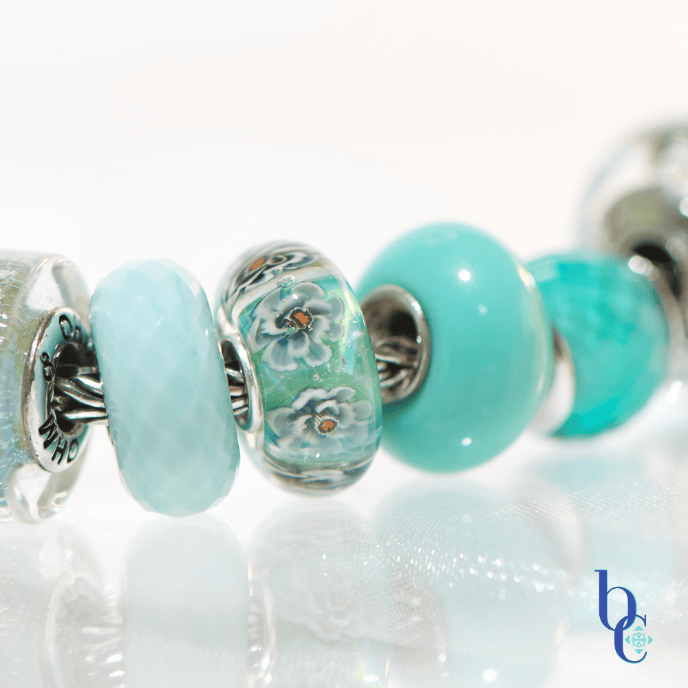
- Living Coastal Relics (The Banker Ponies): The untamed herds of wild mustangs roaming the islands remind us of the inherent, organic nature of artisan glasswork. The floral-like core detailing inside the focal Elfbeads Azure and the intricate bubbles trapped within the sage TrueBeadz piece feel alive and distinct, ensuring the design never feels overly manufactured or clinical.
- Architectural Giants (Jockey’s Ridge Dunes): The massive, towering sand formations of the Outer Banks dictate the landscape’s visual hierarchy. In this layout, the deep, highly saturated Elfbeads Azure acts as our architectural giant. It serves as the indisputable focal anchor, drawing the eye immediately to the center before the colorblocking gently slopes downward into the lighter, frothier mint tones.
- A Stage for Innovation (First Flight): The windswept dunes of Kill Devil Hills provided the exact aerodynamic conditions needed for the Wright Brothers to achieve the impossible. Let this layout be a reminder to push your own creative boundaries. Step away from safe, predictable neutrals, trust the structural mapping of your colorblocking, and allow your high-contrast pairings to truly take flight.
A Photographer’s Perspective: Light as the Catalyst
When you’ve been behind a camera as long as I have—the technical math of a shot eventually just becomes muscle memory. In my studio, when I bring a new stack under the lens, I am no longer actively calculating depth of field or measuring light ratios. Instead, my approach is purely intuitive, and it always begins with one thing: the light.
Light is what motivates me in every single situation, both indoors and out. It absolutely has to be the catalyst for the shot, because it is the only thing that brings true life and dimension to the subject, no matter what it is.
Looking through my lens at this Cerulean Shift design, here is a glimpse into how I let the light dictate the visual rhythm:
- Waiting for the Glow: I am constantly tilting the lens just a fraction of an inch until I see that perfect, crisp pool of light hit the smooth curve of the domed teal glass. It’s that exact moment when the glass stops looking like a solid object and starts looking liquid.
- Feeling the Grit: The magic of a high-contrast stack is the friction between the beads. I want the image to translate exactly how it feels to run your thumb across the bracelet. I adjust my angle until the light catches the sharp, icy facets of the aqua accents, making them aggressively pop against the smooth, pale sage neighboring them.
- Letting the Core Speak: With a focal piece as intricate as the Elfbeads Azure, the artisan details have to be the star. I simply move around the bead until the internal floral patterns and the subtle metallic dust inside the glass suddenly wake up and grab the studio light.
- The Double Impact: That highly reflective surface underneath isn’t there for a complex, calculated studio setup; it’s just there because it visually doubles the saturated blues and greens. When the reflection catches the light perfectly, it gives the whole stack this incredible, floating depth.
Ultimately, I let the jewelry and the light guide the shoot. If the silver cores are shining, the sparkle is there and the glass is glowing, I know I have the shot.
CharmStack© Visualizer Diagram
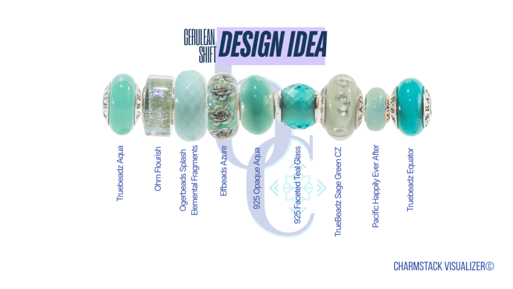
The Cerulean Shift Collection
A high-contrast curation of icy teals and organic sage greens.
| Element | Material Details | Visual Role |
|---|---|---|
| Focal Anchor | Elfbeads Azure | High-gloss deep teal to ground the design. |
| Faceted Accents | Aqua Opaque & Clear Faceted Glass | Maximizes light refraction and creates a “sunlit ripple” effect. |
| Balancing Tones | Smooth Pale Sage, Turquoise & Aqua Glass | Provides visual rest and organic contrast against the bold blues. |
| Hardware | Sterling Silver Chain & Stoppers | Crisp framing that enhances the cool, icy palette. |