Stop Guessing, Start Prototyping: Mastering the Charmstack Visualizer© Method
We have all been there.
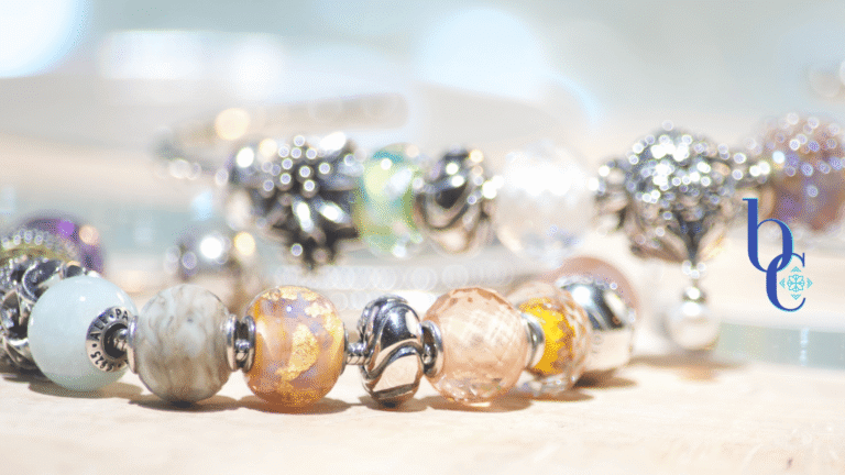
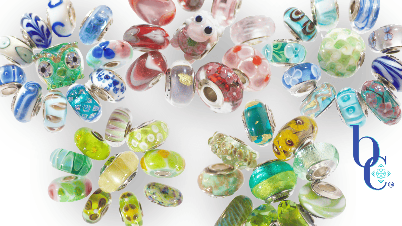
You see a bead online. The glass looks like captured starlight; the silver work is intricate. You click “Add to Cart,” wait five days for shipping, and tear open the package with excitement. You slide it onto your bracelet, expecting magic… and it falls flat. The tone is wrong. The scale is off. It clashes with your favorite Murano already on the chain. You need to try my method of coordinating charms: the CharmStack Visualizer Method Tutorial can show you how!
That is the “Beige” way of collecting: expensive trial and error.
As a UX Designer, I don’t build websites without a wireframe. As an Art Director, I don’t run a photoshoot without a storyboard. So why are we building expensive jewelry collections without a prototype?
Enter the Charmstack Visualizer Method©.
This is my proprietary method for “digital bead-boarding.” It is the bridge between the bracelet in your head and the bracelet on your wrist. Today, we are moving from the jewelry box to the digital whiteboard to save you money, time, and creative heartbreak.
The Digital Sandbox
The concept is simple: We use a digital whiteboard (I prefer Canva) to simulate proximity.
Color theory is tricky. A “Teal” bead might lean green in isolation, but look unmistakably blue when placed next to a copper charm. By using the Charmstack Visualizer, we can test these relationships before a single cent leaves your bank account.
- Step 1: The Audit. Upload photos of the charms you already own.
- Step 2: The Hunt. Screenshot the beads you want to buy (store images work perfectly here for your own private use).
- Step 3: The Prototype. Arrange them on the whiteboard. Don’t just line them up; stack them. Overlap them. See how the “visual weight” shifts when you move a heavy silver bead to the center versus the end. Look at the colors, do they match your vision of the design? If not, change them out!
I know what you are thinking. “Diana, screens are backlit. Glass is reflective. Does it actually work?”
From Pixel to Platinum (The Reality Check)
This is where the Art Director in me needs to show you the receipts.
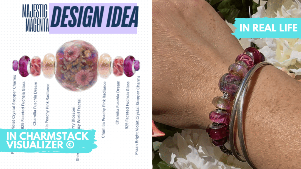
The Charmstack Visualizer doesn’t just show you colors; it shows you rhythm. It predicts how the light will catch the faceted glass versus the smooth silver. It lets you “fail fast” digitally, so you succeed brilliantly in reality.
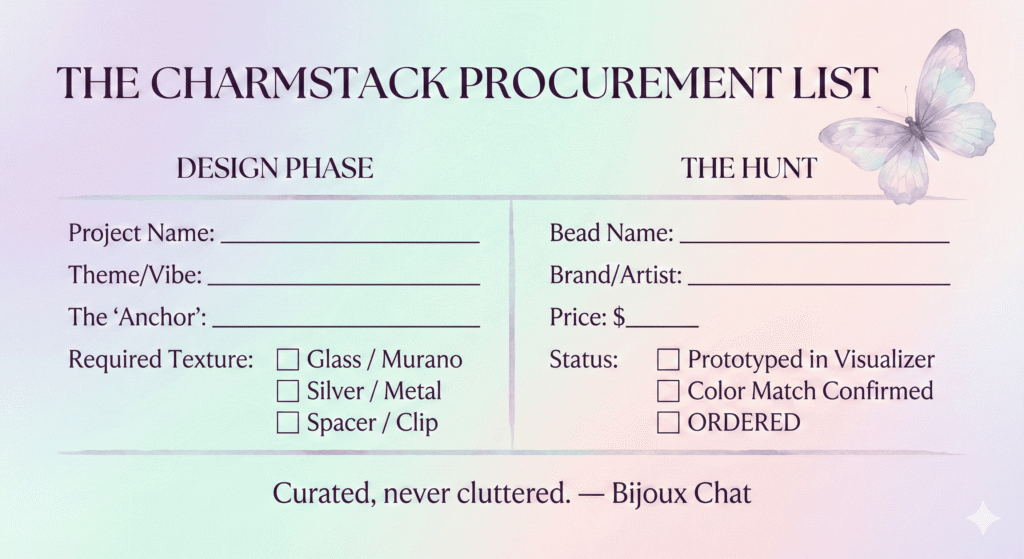
The Curator’s Shopping List
Once you have your design locked in Canva, you don’t just shop; you procure. You have a plan. You aren’t distracted by shiny objects that don’t fit the brief.
To help you bridge the gap between your digital design and your physical order, I’ve created a “Charmstack Procurement List” for you to download. It’s designed to sit right next to your keyboard while you hunt.
Design with Confidence
Your jewelry collection shouldn’t be a source of stress or “buyer’s remorse.” It should be a curated gallery of your taste. By using the Charmstack Visualizer, you’re taking control of the narrative.
You are no longer just a collector; you are the designer.
Here’s Something to Look Forward To!
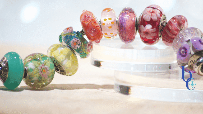
Once you have gathered your palette, the next Art Director decision is placement. I’ve created a post that’s a mini masterclass in how to group those beauties you just selected. Check it out and you’ll see the visual difference between flowing ombre or block color themes that will completely change the rhythm and texture of your final bracelet.
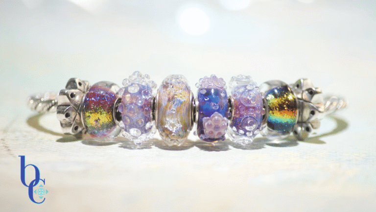
Use Your Minimalist or Maximalist Superpowers
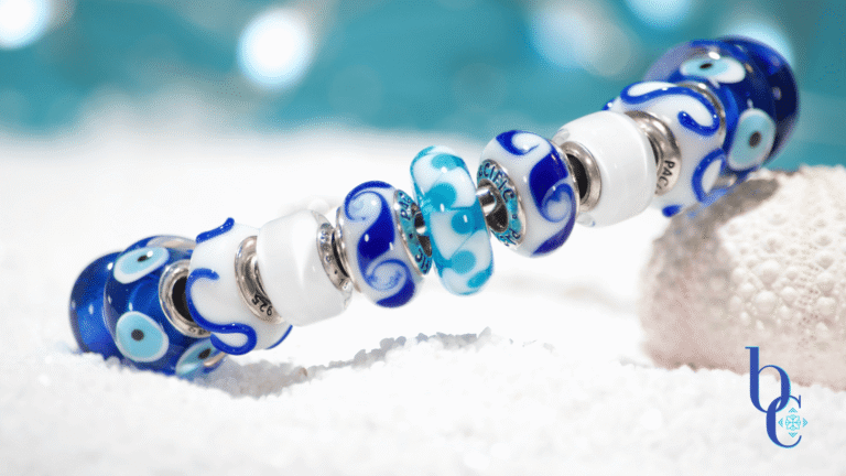
You can even branch out further than ombre or block color themes to a highly saturated color design like our magenta aesthetic. Embracing high-contrast, electric color combinations is the ultimate exercise in dopamine dressing. The flip side of that is choosing one or two colors and building a whole design around them. We’ve got you covered there with a single, bold sunflower bangle that creates an intentional focal point that acts as the ultimate anti-beige power move and a two color beauty, the blue & white mediterranean styled design that gives a crisp edge to any look.